How To Create More Intuitive Styling Using CSS border-box Box Model
April 06, 2022 - 3 minutes
One of the most controversial aspects of frontend development is styling. Whether you’re using React, Angular, Vue, Svelte, or any other frontend library, you either hate it or love it. But regardless of how much or little you enjoy the CSS part of your frontend development, it’s an unavoidable one.
Personally, I found that the CSS box model is one of the most straightforward but at the same time complicated concepts to work with. In theory, it’s responsible for the width and height of an element and there are only 4 things that you need to consider for it: the content area, the paddings, the border, and the margins. But in practice, it can be difficult to make all of these 4 aspects work intuitively together in a way that results in flexible and responsive user interfaces.
Some people would even argue that it can be quite overwhelming at times. And I was one of them.
The Default content-box Box Model
In CSS, the box model of an element can be changed using the box-sizing rule. There are only two options and by default, the box model is set to content-box. In this box model, the width and the height that are set onto the element only apply to the content area of the element.
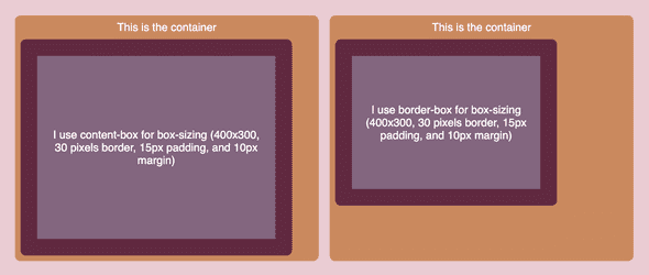
Let’s say we have an element with a width of 400 pixels and a height of 300 pixels. But due to design reasons, it should now also include paddings (15px), a border (30px), and margins (10px). After setting those CSS rules, the element is now no longer just 400 by 300 pixels. This is due to the content-box box model. Instead, only the content of the element will be 400 by 300 pixels. The entire element will be 490 pixels wide (400 + (15 + 30) * 2) and 390 pixels high (300 + (15 + 30) * 2)).
Although this is the default and most people will be adjusted to this model, it feels counterintuitive to me. The problem that I experience with this box model is that it treats the border and padding differently than how my mental model does it. Instead of considering the dimensions of elements based on solely their content, I think about them as a whole including the padding and borders.
For me, this made the process of sizing elements quite tedious. You would have to start on the inside with the content, go outwards for the entire element to include the border and padding, and then backtrack inwards again to calculate the different sizes.
The border-box Box Model
This is where the other box model option comes in, border-box. Instead of only considering the content area of an element for its width and height, this box model takes all of the content area, the paddings, and the border into account.
So using the previous example, the entire element itself would still remain 400 pixels wide and 300 pixels high. Instead of adding the padding and border outside of these dimensions, they’re added on the inside. So the content would ultimately be 310 (400 - (15 + 30) * 2) pixels wide and 210 (300 - (15 - 30) * 2) pixels high.
This made things a lot more sense to me and allowed me to create styling that felt more intuitive. Now, if I provided an element with certain dimensions, it would be guaranteed that the element would still be sized according to those specifications. While the content-box box model reasons about the size of UI on the level of its content, the border-box box model does it on the level of the entire element.
